Before a guest ever enters, they've already formed an opinion. Built in seconds, with merciless precision.
In great establishments, there's a figure you often don't notice. Which is precisely the sign he's doing his job well.
The maître d'hôtel.
The one who welcomes without ostentation. Who guides without directing. Who makes every detail seem obvious, as if the experience organized itself.
The first impression, before arrival
80% of high-end travelers visit an establishment's website before booking. Often multiple times. On mobile, while traveling, at improbable hours.
That site is your digital maître d'hôtel. It receives before you do. It sets the tone. It tells what the experience will be.
Confusing navigation, approximated images, slow loading times: signals the visitor reads instantly, without knowing it. Quality is felt before it's seen.
The most common mistakes
Too much information, not enough sensation. Hotel websites enumerate amenities, services, rates. What the visitor seeks is an emotional promise. What it feels like to be there.
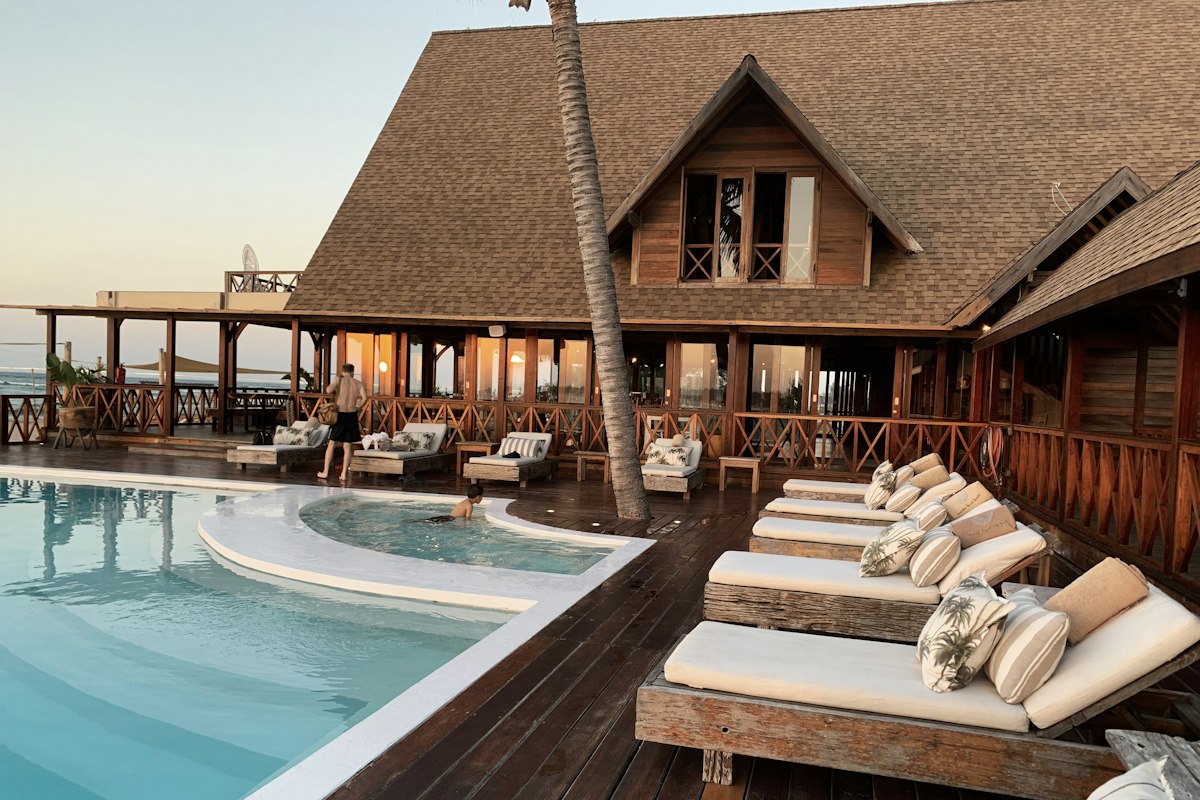
Generic images. A pool photographed like a pool. Luxury lives in light, angle, the moment chosen.
Inconsistent tone. Refined on the homepage, abrupt in the FAQ. The register must be constant from title to cancellation terms.
What a good hotel website should do
It should create a state of mind.
Not inform, prepare. The visitor leaving should feel they've already begun their stay. A slight impatience. A quiet certainty it will be good.
This requires editorial care. Sincere photographic work. Information architecture built from emotion, not from marketing plans.
An investment, not an expense
A well-built website isn't a cost. It's a salesman working 24/7, in every language, across all time zones. Treat it as you would recruiting a head of reception. It's one of the most profitable investments an establishment can make.